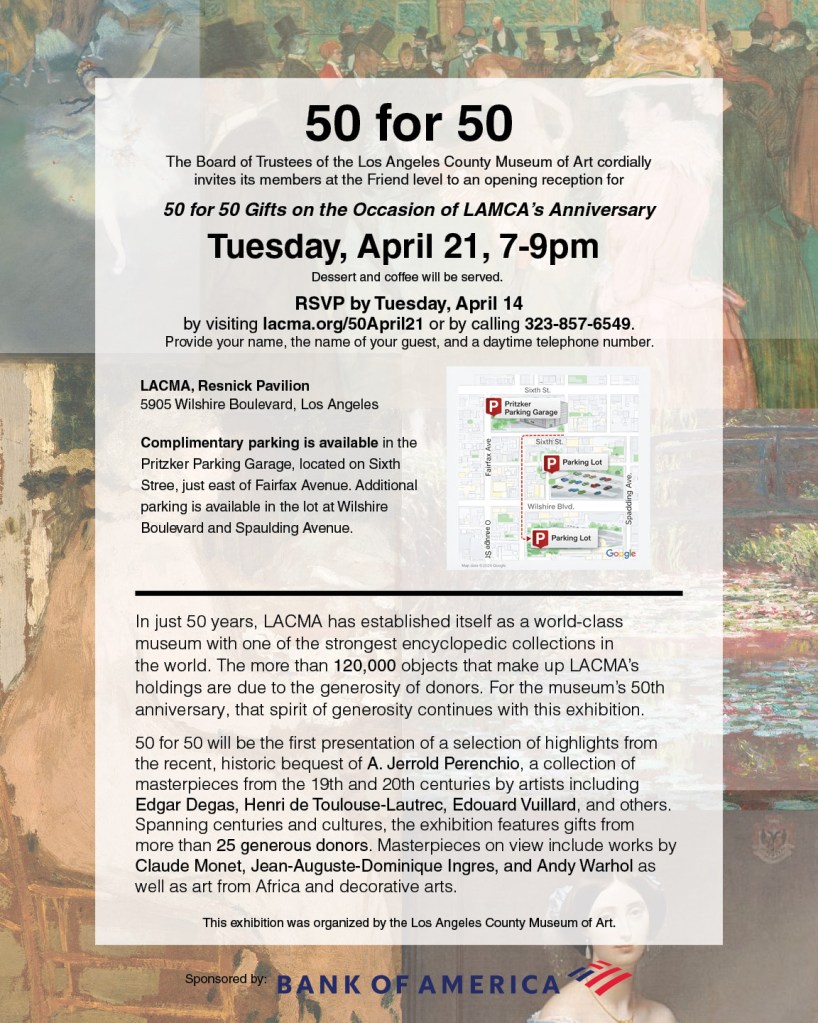
This was an assignment where we were just given the text info and told to create a poster with different tones through the use of recognizable type styles and categories.
This first poster, I chose to use Helvetica, the san-serif type in the Transitional category. I wanted the poster to have a modern informational tone.
The second poster, I used the font Miller Display, a serif Transitional category. I wanted the tone to feel elegant, old timey tone.
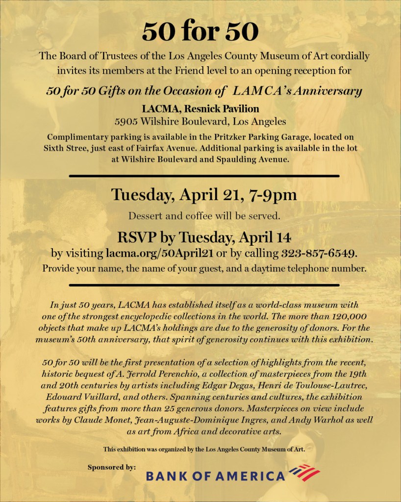
I read the paragraph provided and looked up the artists that were mention and chose some of their works for the background. I also tried to make the important information more noticeable by making them larger and bolder. In my personal opinion, they came out pretty well, especially the second poster.

Leave a comment